According to the dictionary the definition of Surrealism is a 20th-century avant-garde movement in art and literature which sought to release the creative potential of the unconscious mind, for example by the irrational juxtaposition of images. Artist who are inspired by the surrealism movement look into the fine like between reality and the dream world. They use juxtaposing images to demonstrate this and create the weird and wonderful.
The characteristics of surrealism are all based around the subconscious, they took a lot inspiration from Sigmund Freud's psychological theories on ego, superego and id.
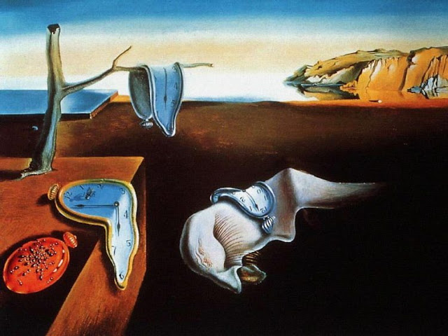
Some famous examples of surrealism are:


Salvador Dali - The Persistence of Memory
Wanting to portray that time as we know it is actually meaningless. The piece is the inner workings of Dali mind. He actually described his work as “hand painted dream photographs.”
The characteristics of surrealism are all based around the subconscious, they took a lot inspiration from Sigmund Freud's psychological theories on ego, superego and id.
Some famous examples of surrealism are:
René Magritte - This is not a Pipe
Magritte believed that art was not reality but actual a representation of it. IN order to highlight this point he painted a piece called 'This is not a Pipe' the message being that although yes he had painted a pipe is wasn't an actual pipe but an imitation or representation of one. This painting embodies everything surrealist artist strived for as it takes away the symbolism of the original meaning and offers the viewer something new. Is this a painting of a pipe ? Or a representation of a pipe?

René Magritte - The Son of Man
Once again Magritte's painting challenges the reader to rethink what they originally think at first glance. He believed that his painting would deliver a important message about the individual. He said that he believes “Everything we see hides another thing. We always want to see what is hidden by what we see. There is an interest in that which is hidden and which the visible does not show us. This interest can take the form of a quite intense feeling, a sort of conflict, one might say, between the visible that is hidden and the visible that is present.”

Salvador Dali - The Persistence of Memory
Wanting to portray that time as we know it is actually meaningless. The piece is the inner workings of Dali mind. He actually described his work as “hand painted dream photographs.”

Comments
Post a Comment