
The Bechers & Idris Khan

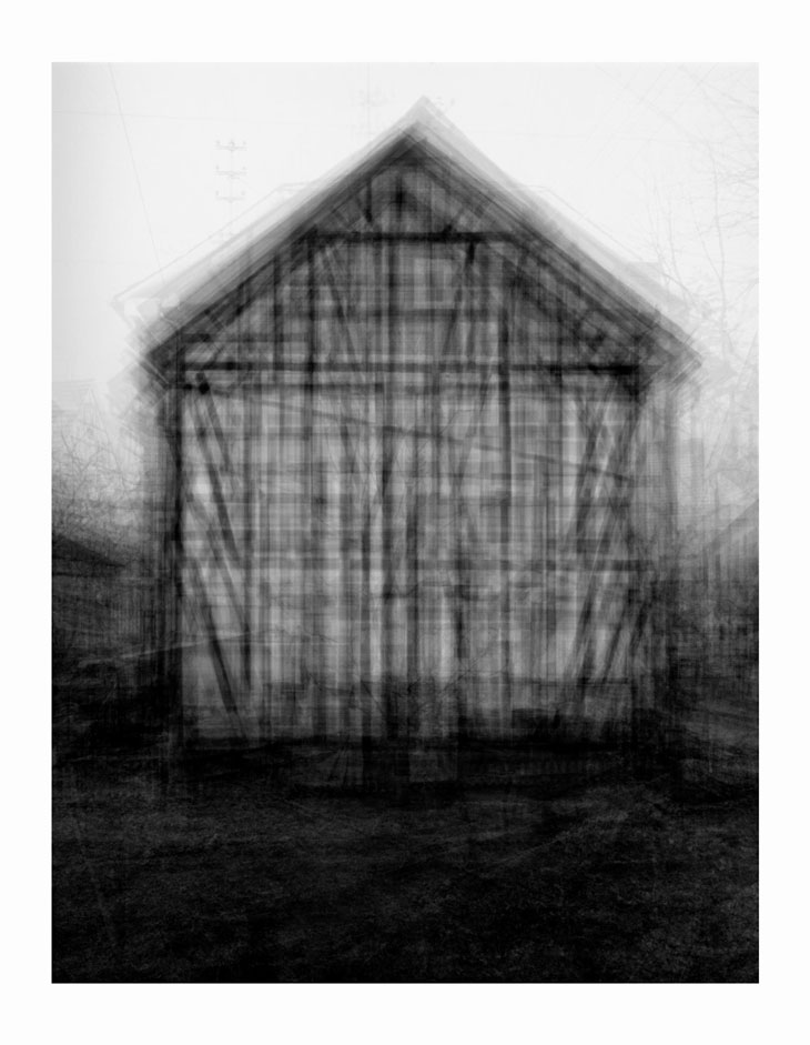
During the Lecture two lots of work caught my eye, the first from The Bechers and the second from Idris Khan. 


Brent and Hilla Becher made photographic typologies as an archive of uniform photograph. The grid structure helps give symmetry, Each object is large and as important as any other. Consistency is key in the photographs of the gas containers, the light, scale and viewpoint all correspond. Their work was often placed in a grid of neutral white frames.


Idris Khan was born in England, 1978, he completed his master in 2004 at the Royal College of Art in London.  He works in sculpture, painting and photography. 

His ideas are based on a repeating process of creation and deletion, or even adding of new layers while retaining traces of what has gone before. He is well known for his large-scale works in which techniques of layering are used to arrive at what might be considered the essence of an image, and to create something entirely new through repetition and superimposition.

The reason for my interest is his work, is his photography manipulation series called ‘Idris Khan’s Every…. Bernd And Hilla Becher’ series appropriates the Bechers’ imagery and compiles their collections into single super-images. In this piece, multiple images of American-style gabled houses are digitally layered and super-imposed giving the effect of an impressionistic drawing or blurred film still.


Comments

Popular posts from this blog

Kandinsky's Experiment - Circle, Square, Triangle

Wassily Kandinsky, a student from Bauhaus, circulated a questionnaire trying to determine the universal response for the relationship between colour and form. The questionnaire consisted of three shapes, a triangle, square and circle, he recipient was then to colour each one with a different primary colour etc. Red, blue or yellow.  His questionnaire received a remarkable about of the same response. This may because those in the school had the same theoretical ideals. They believed that the triangle was yellow, square to be red, and the circle to be blue. This product influenced many projects in the early days of Bauhaus. They were also to give an explanation where possible.  I decided to do this myself deciding differently to the Kandinsky original consensus. I felt as if the triangle should be red as this is what most red warning sign are shaped and coloured like. The circle is to be yellow as it re...

AfterEffects - Exploring Geometry

In this workshop we were to explore geometry in relevance to AfterEffects. I chose to use a pink and white colour scheme to begin with but in my second attempt I used a simple black and white, which I believe looks more effective. I learnt the following techniques in the workshop: transitions such as Venetian blinds and how to distort objects. The wiggler was very simple to use once I got the hang of it.  First Attempt - Exploring Geometry from Jade Holmes on Vimeo . Workshop 1 - Second Attempt from Jade Holmes on Vimeo .

AfterEffects - Z Space

Before class we were asked to create a one layered composition on Illustrator, ensuring every object was on a separate layer. This would make life easier when reopening the Illustrator file in Adobe AfterEffects. Once deciding on a space theme, I used royalty free images to create planets. When in illustrator I created simple circles and then used the 'Pathfinder Tool' to cut the texture into a planet shape. I used the pen tool to create my rockets and spaceships.   T he outcome of this workshop was to create 10 second movie using my prepared artwork, and to learn the use of 3D tools in After Effects, including cameras, pre-comps, building and constructing 3D scenes, textures and objects in addition to special effects. Sara gave as an excellent example of what we were going to learn how to achieve, and the extent of what the tools she was teaching us could achieve.  MGMT - All We Ever Wanted Was Everything from oneedo on Vimeo . Above is a screen of my...