We started the lecture looking into the definition of Visual Communication.
Two dimensional images such as advertising, industrial design, typography, graphic design, drawings, illustration, animation and sign are examples of visual communication. It is a way to convey ideas and information which can be digested in a visual form by being viewed or read. The most successful visual communication can be understood, with or without complementary typeface.
What is theory and why study it?
The google definition of theory is ‘a system of ideas intended to explain something, especially one based on general principles independent of the thing to be explained.’
The reason we study theory is due to it providing us an explanatory framework which can be used to explore or support ideas, develop hypotheses, or as a basis/critique.
A quote was highlighted by Paul Rand which reads: ‘Intuition is a flash of light conditioned by experience, culture and imagination.’ This links to the component which make up theory; Experience, culture and imagination.
When working in the studio I need to have the understanding of substance as well as style. Delving deeper into how things are or should designed but asking why they are. Linking ideas through a framework which will help others understand your ideas as well as yourself.
Getting the audience to ask questions is something which effective visual communication will achieve by raising historical, political, philosophical and aesthetic questions about design.
Design Authorship
Design Authorship is all about command your own creativity. Critical thinking about your work as if you’re your own client. The film theory ‘Auteur’ demonstrates authors creating their own voice which is apparent under all the other present layers for example throughout Tim Burton work similarities can be seen in colour pallets, symmetries etc
Bridging the gap, we looked into theory as practice, how does theory translate to actual real life? This can be seen in advertising, when an advert makes you want to decoded what the designer is trying to portray. Advertisements created correctly will make the audience think.


This advertisement by Heinz does exactly this; playing off the fairy tale Jack and the Bean Stalk subtly highlighted by the stalk wrapped around the bean can. The magic beans are the huge element of the story so therefore they are saying that their beans are a big deal.
Another interpretation would be that like the stalk you can grow big and strong if you eat the beans. This defiantly something which could convince children to eat Heinz product.
Oscar Widle said ‘An idea which is not dangerous is unworthy of being an idea’ This essentially means that to be truly creative my ideas need to be brave, challenge limits and social norms.
Artist and groups introduced to us
Tshirtism – experimental JetSet (2001)
Instead of focusing on what will be popular they focused on what looks good to them and become successful in the way.
International yves klein blue - Took claim over a single colour
As written on the slide in the lecture a design manifesto is:
‘A manifesto is a published verbal declaration of the intentions, motives, or views of the issuer, be it an individual, group, political party or government. A manifesto either accepts a previously published opinion or public consensus, or promotes a new idea with prescriptive notions for carrying out changes the author believes should be made. It often is political or artistic in nature, but may present an individual's life stance.’
We then looked into Daniel Eatock’s manifesto to begin having ideas about our own manifesto’s
Highlighted are the parts I agree with the most:
• Begin with ideas
• Embrace chance
• Celebrate coincidence
• Ad-lib and make things up
• Eliminate superfluous elements
• Subvert expectation
• Make something difficult look easy
• Be first or last
• Believe complex ideas can produce simple things
• Trust the process
• Allow concepts to determine form
• Reduce material and production to their essence
• Sustain the integrity of an idea
• Propose honesty as a solution.
Another manifesto we glanced at were first things first manifesto – 29th November 1963, published in 1964 by Ken Garland
Artist & designs work is influenced by historical, culture elements as well as societies they live in. it is important to ask the right questions when decoding what an images is about: I ask questions such as:
· What was happening in the world when item was created?
· What ideas/theories where emerging as a result?
· What was happening in art and design in said era?
· Look at contempory examples – what’s happening today? Is there a link?
Examples of work where I will ask these questions include?
PERSEPOLIS, MARJANE SATRAPI /
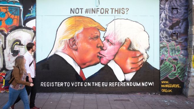
Brexit
Napalm – Banksy

The image above at first glance looks like two iconic characters kidnapping a naked girl which is made disturbing by the look on her face. It is not until you realise that said little girl if from the photograph taken on June 8, 1972. She is running in fear due to the mass amount of Napalm and Agent Orange air-dropped onto the jungle where she lives (Vietnam). During the Vietnam war, the Americans decided to drop essentially spray really strong weed killer on the jungle in an attempt to kill the trees so they would be able to see their enemy, the Vietcong. Not factoring the liquid was harmful to skin and would eat through both clothes and skin. The little girl ripped her clothes off in an attempted to stop the burning. The important questions, for me, to ask is why is the little girl holding the hands of Mickey Mouse and Ronald McDonald? Maybe because they are two icons in Americans pop culture, the culprits of the Napalm attack.
Reference List:
Images
Heinz Benz - https://s-media-cache-ak0.pinimg.com/originals/25/98/91/259891512ab7b1e0f104382809afbbe7.jpg
Brexit - http://ichef-1.bbci.co.uk/news/660/cpsprodpb/17CD9/production/_89779479_89f14579-8f34-4e36-8e11-e890a01d303e.jpg
Napalm - http://hanguppictures.com/Images/Urban/banksy-prints-napalm.jpg?Action=thumbnail&Width=1200
Punk is not dead - https://s-media-cache-ak0.pinimg.com/originals/6d/08/46/6d0846f99b20f161a7c5566a5a2e0273.jpg
Comments
Post a Comment